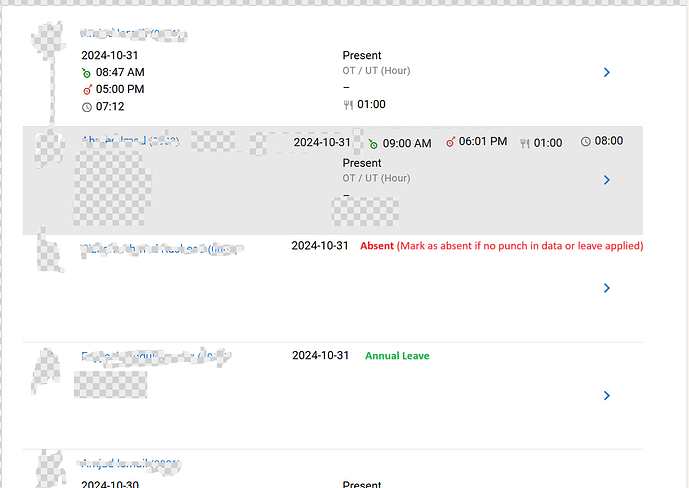
For mobile view i think current implementation is ok. but i feel the desktop view can be improved. There is too much blank space in desktop view. Here is an example of what i am talking about. with less clicks, more information is visible.
One more thing: in the manager, the ‘search’ and ‘filter’ functions are currently combined into one. I believe this should be changed, as search and filter are typically treated as distinct functions in most software I’ve seen. Separating them would likely make the interface clearer and less confusing.
OK, I see 2 issues here:
I do agree to certain extent, but…
What’s your screen resolution? Which screen resolution is the most popular that I should optimise for? This directly determines how many columns of data should be shown, otherwise part of the columns will still be out of view and you will constantly need to scroll horizontally.
For most modules, there are simply no meaningful keywords for you to perform a search, and filter makes more sense.
I am not a programmer, so i dont know much about these things. I just gave an idea, based on other programs that i have seen. If its not possible its ok to leave that out.
look at the below SS. Here what i meant is you have used the “search” icon. To do a filter too you have to click in this “search” icon.

Yes, I know, because Search icon is easier to understand than a Filter icon.
Just using the current resolution of HR.my, If we re-arrange the data in a single row, then more data will be visible.
Screen Resolution means how many pixels your screen could display. The higher the resolution, the more details will be shown.
My screen resolution is 3840*2160. But i dont know why this can’t be done
Try lowering your resolution, e.g. 800x600 and you will understand what I mean
I am now at 800*600, but what i said is valid. I can put the attendance data in a single raw and it fits to the screen. Just the difference is text size is now bigger.
I think there is a little confusion i am not talking about the empty space i have in this attachment.
If you take a look at the screen image, it says 2626x717, obviously your resolution must be larger than 2626 horizontally.


